Understanding Rails Apps Through Powerful Visualizations
When it comes to reviewing a Rails app, two essential factors stand out: discoverability and good visualization of the code structure. Being able to comprehend the core elements and potential threats of a Rails app is crucial for developers and stakeholders alike. In this article, we will delve into the significance of visualizations in app reviews, with a focus on the insightful charts provided by Attractor on RailsReviews.com.
Note: The example app used in this article is the excellent RailsDevs.com app by Joe Masilotti.
The Power of Visualizations in Rails App Reviews
Visualizations are the backbone of any comprehensive Rails app review. They present complex data in a clear and accessible manner, helping reviewers quickly grasp the app's strengths, weaknesses, and areas that demand attention.
Obtaining Insights from Code Metrics
Let's take a closer look at how these visualizations aid reviewers in understanding and analyzing a Rails app:
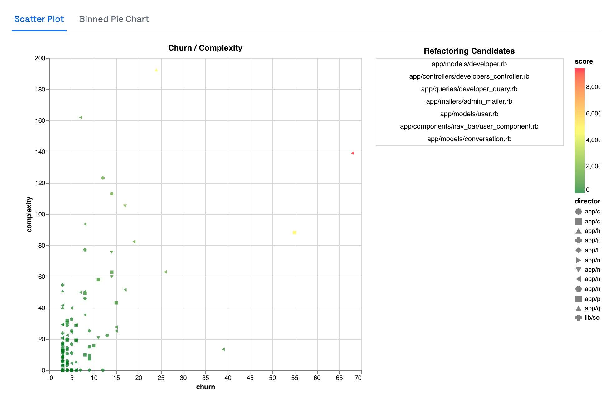
1. Churn vs Complexity Graph

The churn vs complexity graph offers valuable insights right off the bat. In this specific case, it highlights the significance of the Developer concept within the app. The model, controller, and query related to the developer stand out with the highest complexity and frequent changes. This insight immediately directs attention to areas where thorough examination and potential optimization might be necessary.
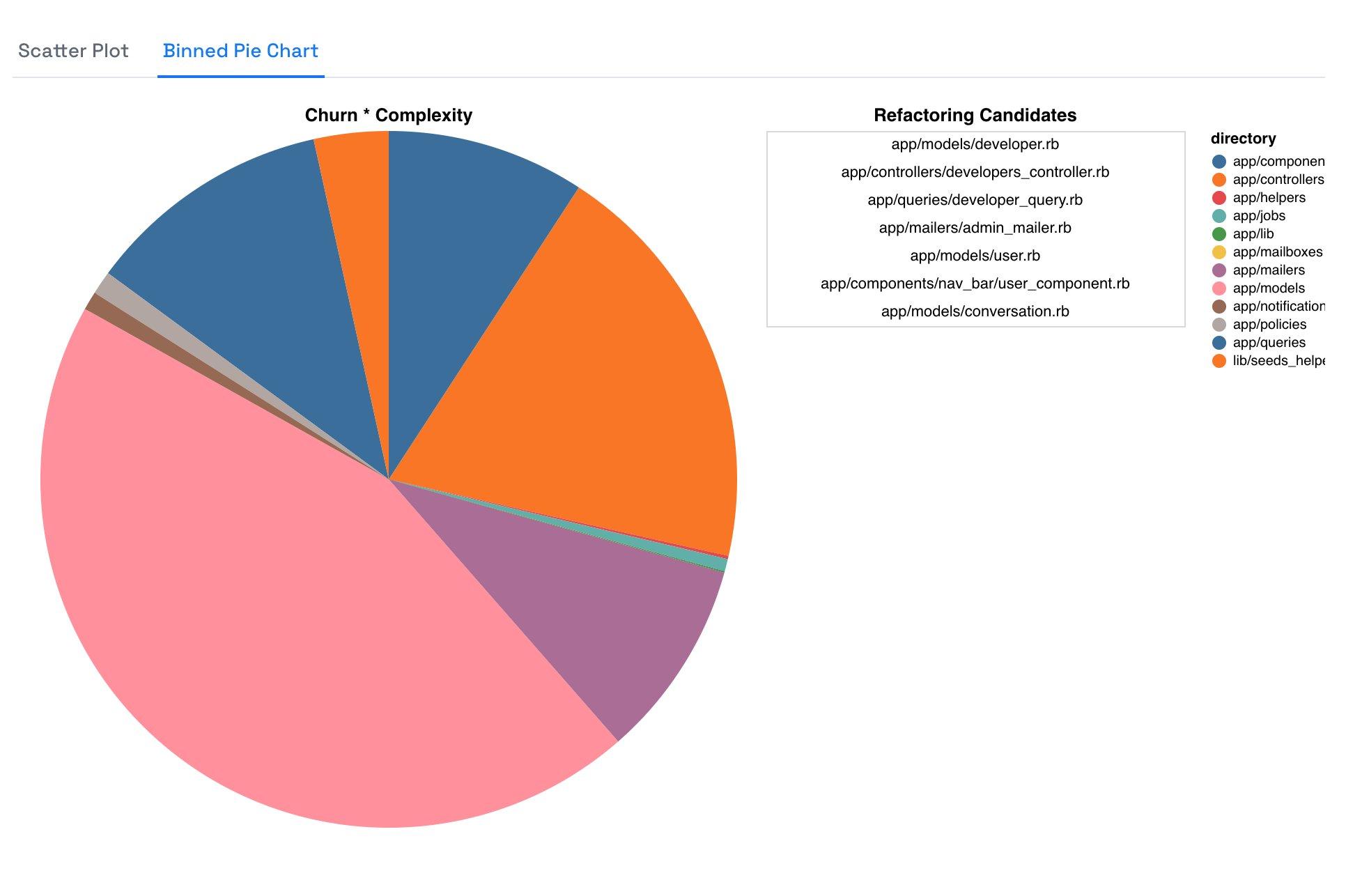
2. Binned Churn/Complexity Pie Chart

The binned churn/complexity pie chart is a valuable representation of where the bulk of work is being done in the app. As expected in a app, here the majority of the work is concentrated in app/model. This finding is reassuring, as it aligns with the typical Rails development pattern. Any significant deviation from this norm would undoubtedly raise questions.
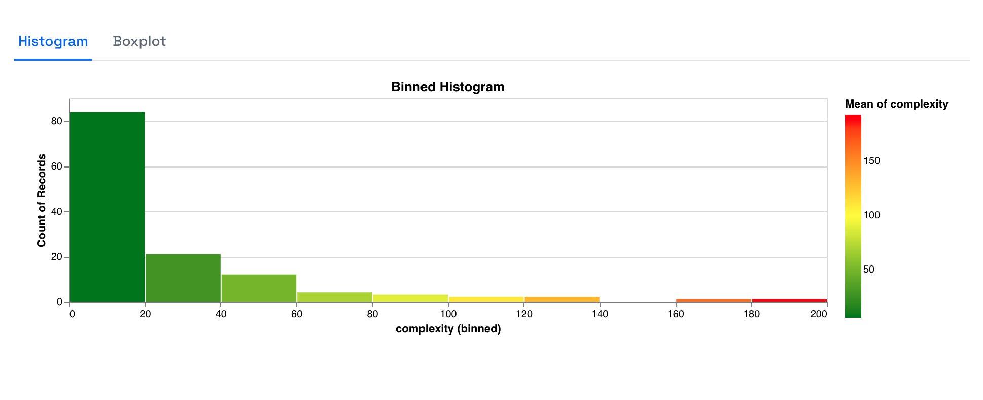
3. Binned Complexity Histogram

The binned complexity histogram provides an understanding of the distribution of files based on their code complexity. This app appears to have numerous small and simple classes, while only a few "god classes" assemble a significant amount of functionality. This distribution insight sheds light on the overall maintainability and potential architectural improvements that can be made.
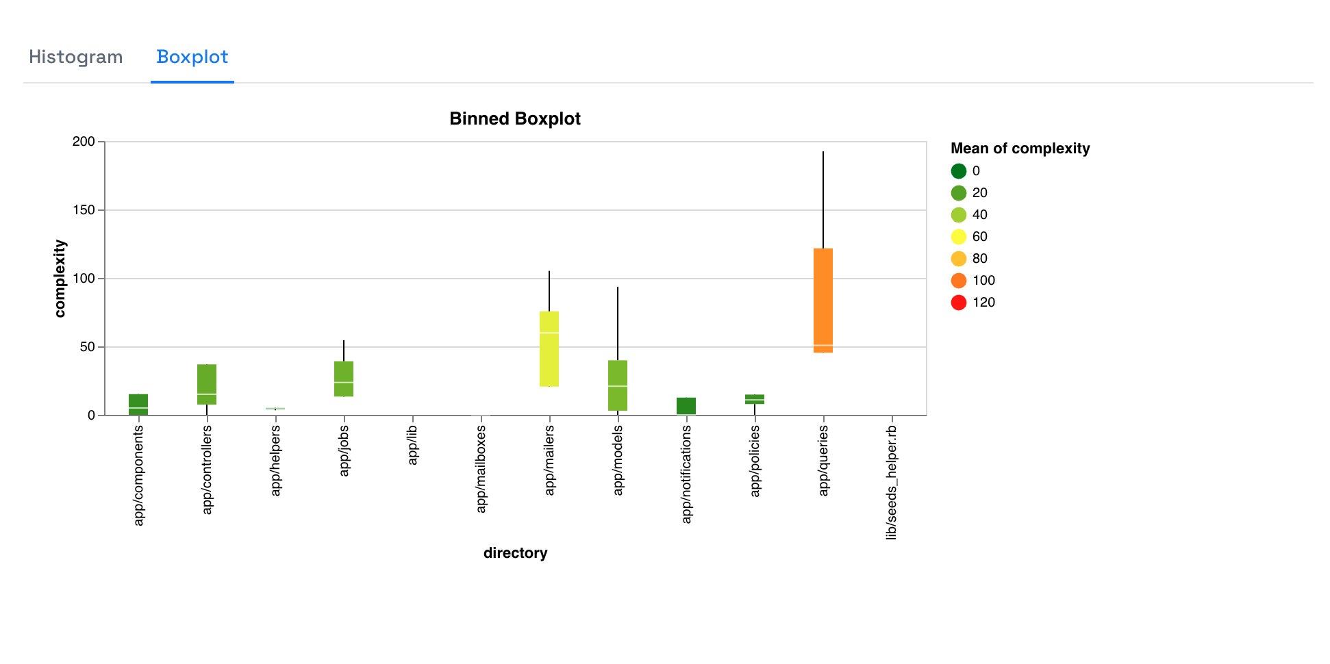
4. Binned Complexity Boxplot

The binned complexity boxplot offers a variation of the pie chart from earlier. It exclusively measures complexity, disregarding how often a file was changed. The display of the distribution in these bins as a boxplot, showcasing the quantiles, provides further depth to the analysis. This helps reviewers understand the spread of complexity within the app and identify outliers or areas that might require refactoring.
Conclusion: Data-Driven App Reviews Facilitated by Code Metrics
In conclusion, visualizations play a pivotal role in comprehending the intricacies of a Rails app. RailsReviews.com understands this importance and delivers in-depth reviews with the help of Attractor's insightful charts. These insights are invaluable for developers, teams, and stakeholders as they make informed decisions to optimize and improve their Rails apps.
If you want to unlock the full potential of your Rails app and make data-driven decisions for improvements, don't hesitate to order a review from RailsReviews.com. Empower your development journey today!
